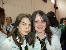
We have decided to make a photographic booklet. We will try to apply a colour scheme and background that will catch their eye but represents the college and the area. The booklet will be a4 folded size (A5) and we would like to use the blue green colours which represents the college style and the seaside area.
This is our target audience: This will be designed for students coming to study here from abroad.This will be targeted at a male and female audience. They will be mainly aged 16+ as our college don't really have people younger than that wanting to study here. We would like them to get the feel of Penwith college being welcoming and fun NOT scary.
I think they would relate to the kind of colours that Truro and Penwith college use because not does it represent the new college well, but it represents the area we are in. The blue/green colours they use represent the countryside and the seaside/beach are we live and study in.
Here are the sort of blue/green colours that our college uses to represent the college and the area around it:
Ideas
16 years ago


No comments:
Post a Comment